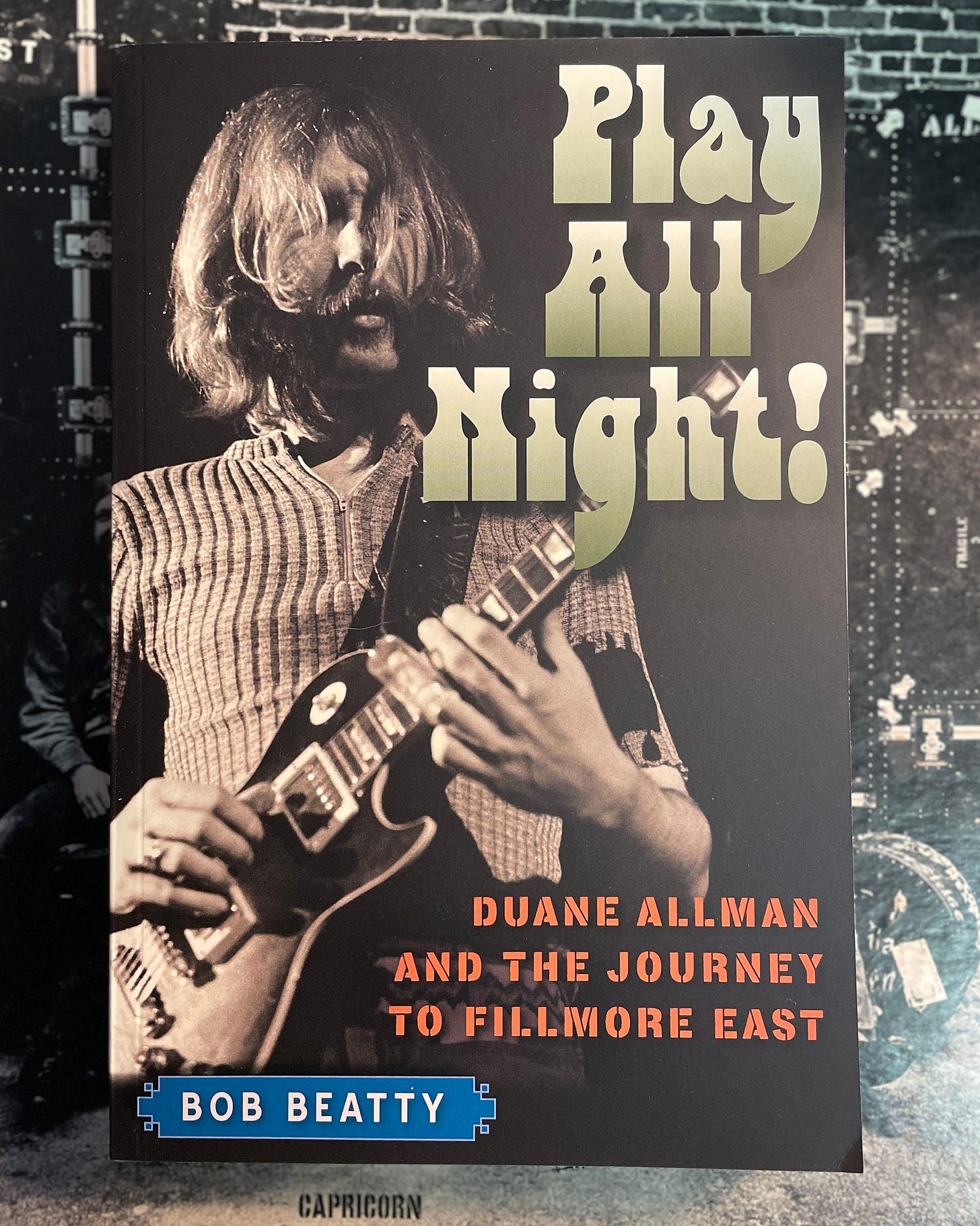
I am writing this on October 21, 2024. It is now officially two years since publication of Play All Night! Duane Allman and the Journey to Fillmore East.1 The reception has been beyond imagination.
The book has continued to sell, so much so that the press is not even interested in a 2nd edition.2 More importantly, fellow ABB hardcores, fans, members of the extended family—even Jaimoe(!)—have expressed how much they enjoyed the book.
Though there are throughlines,3 nearly everyone who’s reached out to me has highlighted a different element of the book from big ideas such as Duane’s leadership (Troy) to minute details like the 31st of February demos in September 1968 (
).I’ve mentioned before how active the Long Live the ABB social media accounts are. When you add up the numbers, I have more than 50,000 followers across all channels.4
But the number one that counts the most is you and the 3000+ (and growing) subscribers to Long Live the ABB: Conversation from the Crossroads of Southern music, history, and culture.
And a particular thanks to my paid subscribers. Y’all rock!
What is Long Live the ABB?
I explained it best in the post I send to all new subscribers:
My premise has always been: “The Allman Brothers Band didn’t die with Duane Allman, and I’m really, really glad for that.”
And that manifests itself in myriad ways here on the blog.
It’s more than just a place for me to tell stories about the Allman Brothers Band.
I’m showing a behind-the-scenes view of how historians interpret the past.
I’m using the ABB and its long tail of influence as my guiding principle.
Such is the case with today’s post, which looks at the Allman Brothers Band from a graphic design perspective. Specifically I’m looking at the evolution of their logo, from a flyer for their first show in Macon, through the iconic stacked ABB logo we know today.
And there’s a twist at the end.
[EDIT OF POST FROM OCTOBER 2023]
My readership has more than tripled since I first posted this, so it’s new to many of you.
October 2023 has been full of pretty significant milestones for me.5 Most notably to subscribers of Long Live the ABB, October 18 was the one-year publication anniversary of my fourth, and most significant book, Play All Night! Duane Allman and the Journey to Fillmore East.
I shared the following on all of my social media accounts6, including here on Notes (you are on Notes, right?)
This came on the heels of learning I’d crossed a threshold of sorts (1,000 subscribers to Long Live the ABB7) and a really killer interview on the Principal Notes podcast of my new bandmate8
9 whose love of “Mountain Jam” rivals my own. Links to the interview on all podcast platforms and on YouTube.I received some kind responses and wanted to say thanks to each of you for joining me on this journey. To be entirely honest, I would be doing this if you weren’t here, but it makes it more fun knowing folks are interested.
What’s in a logo?
I’ve long been fascinated by the visual element of rock music. It started with me pouring over albums. I’d soak in everything, from the lyrics, liner notes, photographs, whatever little information I could glean about the magical sounds coming out of the speakers. No detail was too small.10
I discovered something else in those album covers: a true appreciation/full-blown fascination with graphic design. It extended to football and baseball cards, team logos and uniforms, fonts, magazines, and photography in general.
The Allman Brothers Band have a wealth of this kind of material I can interpret it, which gives me endless fodder for posts such as this one.
The People’s Band
I shared a bit here about the ABB’s first flyer for a show in Macon. Bubble lettering was en vogue; it reflected whimsy and psychedelia of the counterculture. The “logo” (which isn’t a logo, I know) signals this is a band that represents their audience. (So does the copy, btw.)

Of course, Phil Walden and company wanted to capitalize on that and sought to build an image of the group as “the People’s Band”—a concept I explored in-depth in Play All Night.
This was also Duane and the band’s vision from the start. They weren’t going to dress up in fancy clothes a-la Hour Glass, or seek hits on AM radio.
The People’s Band hit the road in May 1969 and never really looked back, logging more than 200 shows and 300 days a year on the road.
This was their image at the time.

This Stephen Paley shot11 is from the Bond mausoleum at Rose Hill Cemetery.12 A slightly different photo appears in color on the back cover of The Allman Brothers Band.13
But I’m not going to focus on that album cover (which itself gives a really killer vibe that reflects my point). Instead, I want you to look at the ABB’s wordmark at the bottom. Though different from the hand-lettering on that first poster, it sure reflects its spirit.
The first (only?) other time I saw this logo in action was this photo from June 1969 on a banner and taped to Gregg’s B-3. (Typically logos are found on bass drum heads, but the ABB drummers weren’t doing that yet.)
These two images are the only usages of this particular logo that come to mind.
Psychedelic font
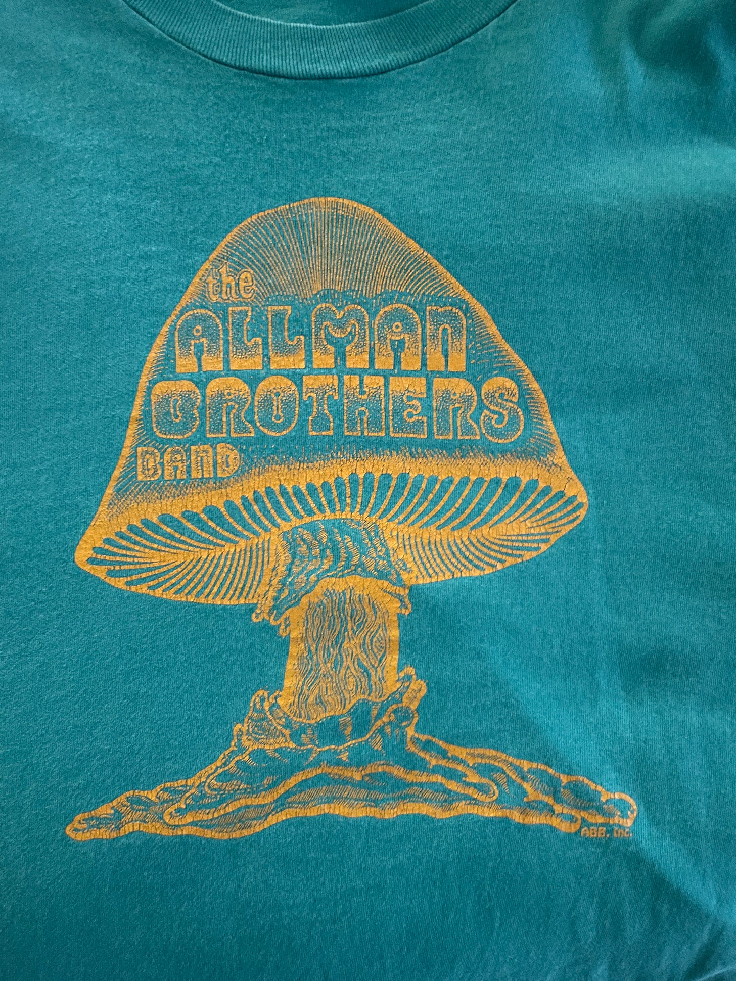
By 1970, artist Flouronoy Holmes of the Atlanta-based Wondergraphics, created the ABB’s iconic mushroom logo. He included “the Allman Brothers Band” in a style adapted from the psychedelic font Wes Wilson created for posters for Bill Graham’s original Fillmore Auditorium.14
Holmes and his Wondergraphics partner W. David Powell used the same lettering for the band’s name on the cover of Eat a Peach (1972).
Logos didn’t always appear on album covers
Capricorn/Atlantic used a generic/unimaginative font for The Allman Brothers Band (1969); however, the Paley cover photo—the band in everyday clothes, standing near on the portico of an old Southern mansion—was evocative.
Idlewild South (1970) featured a modern, sans serif font15, all lowercase (with a studio portrait of the band that I’ve never thought was particularly flattering).
For At Fillmore East (1971), they went back to the People’s Band image: the band name and album title stenciled in white spray paint on a road case and stacked in the upper left-hand corner of the image:
THE ALLMAN BROTHERS BAND
AT
FILLMORE EAST
(You can tell it was hand-painted because it’s what I call “perfectly uneven.” Chalk another up for the People’s Band 🍄.)


None of these wordmarks appeared on anything other than the album covers.
Brothers and Sisters
Judy Reeves Petty came up with the cover concept for Brothers and Sisters. The elegant cursive-like font seems like a formal invitation to a record that is much more joyous than the circumstances in which it was made.
It didn’t even end up on the merch for the tour, which used a block font that combines the look of Civil War recruitment posters with Lost Cause imagery of a plume-hatted cavalier, sword in hand, mounted, bursting through a cannonball-sized hole in a rebel flag.16
Things changed with Win, Lose, or Draw
First things first, the cover Win, Lose, or Draw didn’t have the ABB’s name on it anywhere. There’s lots confusing about the cover design, but leaving off the name of the biggest band in the country was a particularly egregious mistake.
Capricorn realized it and began shipping albums out with this sticker.
Unlike the mushroom or the Eat a Peach cover, this is the first ABB logo to appear on its own. The rock merch business was just getting rolling around this time and Phil Walden was among those at the forefront of that movement. This script wordmark showed up on posters, iron-on transfers, belt buckles, all kinds of 70s rock ephemera. 17
Then came Enlightened Rogues
My guess is you’re pretty familiar with this logo. The band has used it regularly since 1979. (Stay tuned, more below.)
It was the design of artist John Kehe:
I wanted to create a bold “comeback album” jacket, a strong, memorable image for the band, who’d had more than its share of hardship within the group….
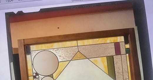
I worked off the title, imagining a classy saloon window with Allman Bros. lettered on it. Right around the corner from me was a stained glass studio called Sunshine Glass Works, so I was able to go in and design the window around the logo I had developed. I then had a giant decal made and we shot it all as one piece.18
One year later, the ABB created yet another wordmark
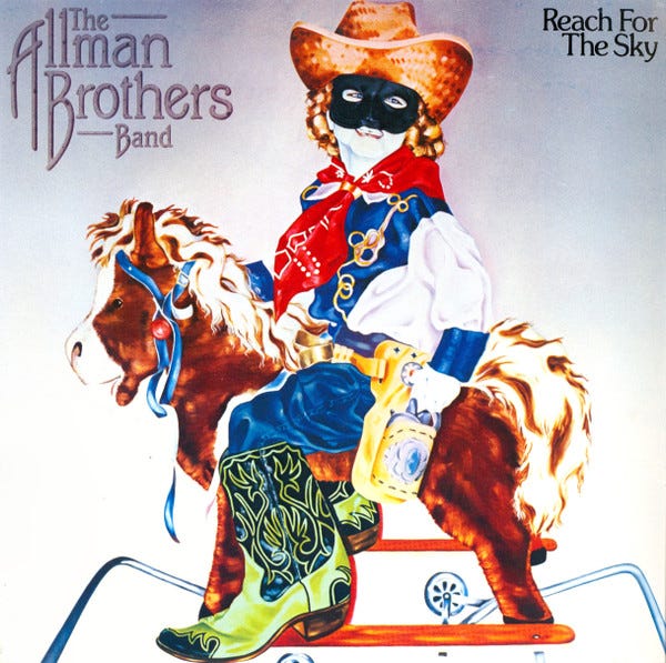
They used this one for two records: Reach for the Sky and Brothers of the Road. This logo also appeared on merchandise and t-shirts.
The ABB went out with a whimper in 1982. Everyone, including the band, considers Reach for the Sky and Brothers of the Road their nadir.19
The Dreams box set
Kehe’s stacked ABB logo returned for the release of the groundbreaking Dreams set in 1989, which precipitated a reunion that lasted 25 years.
The group has been using it ever since, with one slight, but significant modification
“Band” is the same size as “Allman Brothers”
Emphasizing, once again, the importance of the “whole is greater” concept to endurance of Duane’s vision.


The group wasn’t the Allman Brothers—it was always the Allman Brothers Band.
This one word was important for the group as it reestablished its identity for its first new album in almost a decade.
Neither Duane nor Gregg was pleased the group was named for them in the first place. And Duane’s death forever altered its most obvious meaning. But the “Allman Brothers” name always meant more than “band led by brothers Duane and Gregg Allman.”
Calling them the Allman Brothers missed the point altogether, Gregg said to Creem:
“I’d rather be known as the ABB, because people always call us the Allman Brothers and we’re not. We are the Allman Brothers Band.”
Hear, hear!
What about Capricorn’s bankruptcy?
The stacked ABB logo John Kehe created for Enlightened Rogues has remained prominent ever since its return for good in 1989. It’s appeared on album covers, posters, t-shirts, all kinds of swag.
Turns out, Kehe was never paid for his work.
Fortunately he’s not bitter about it at all. In fact, he’s grateful for his legacy. As am I.
Late 1978—I hadn’t been paid by Capricorn in eight months. There was always some excuse—new systems, controller quit, yadda yadda. Then suddenly the label went bankrupt, leaving me holding the bag-$28,00020 worth. I had been Capricorn’s main designer—as a freelancer—for several years at that point. I couldn’t absorb that kind of loss, so it forced me to leave freelancing behind and take a job. My only satisfaction is that the logo lived on.
Thanks for reading. I appreciate having you here.
If you didn’t click on that link above, please do it here. Every tickle of the algorithm helps: Play All Night! Duane Allman and the Journey to Fillmore East.
Basically there’s no need to spend the money, the book will sell regardless.
How well I brought Berry to the fore is one.
A number that doesn’t mean a lot really because of the way the algorithm works/doesn’t work.
The biggest is my wife and I met 30 years ago—it’s also (not coincidentally) the last time I ever smoked a cigarette. Two of the best decisions I’ve ever made.
That number has tripled in a year. Thank you.
Borrowed from Mike Nesmith’s wonderful memoir, Infinite Tuesday.
Sean is related to the jazzman Slim Gaillard, whom first learned of from Jack Kerouac’s On the Road. Dig Gaillard’s “Cement Mixer.”
Discussed this twice recently:
Shout-out New Georgia Encyclopedia and the Georgia Humanities Council!
Posted a Rose Hill story a few weeks back
A scene many fans have reenacted over the years. Myself includes .
Wes Wilson NPR interview, 2016. The font is called Fillmore.
A quick AI search says it’s Air Condensed Thin.
Spoke a lot about that particular image and its meaning from Macon in February 2023 and I will do so again I promise.
Which reminds me, The Allman Brothers Band Classic Memorabilia, 1969-76 by Willie Perkins and Jack Weston is a great book about the ABB. Different than any others.
Here’s my interview with David Goldflies, who was ABB bassist at the time.
Best I can tell, this is well over $100,000 in the 2020s.







Absolutely!....here's more info:
https://www.facebook.com/photo.php?fbid=10156029566085698&id=312475130697&set=a.460260915697
Pretty sure that photo with the alternate logo on Gregg's keyboard is from a free concert they gave in Cambridge Common, Cambridge MA 1969....not sure of month.